Why a New Look
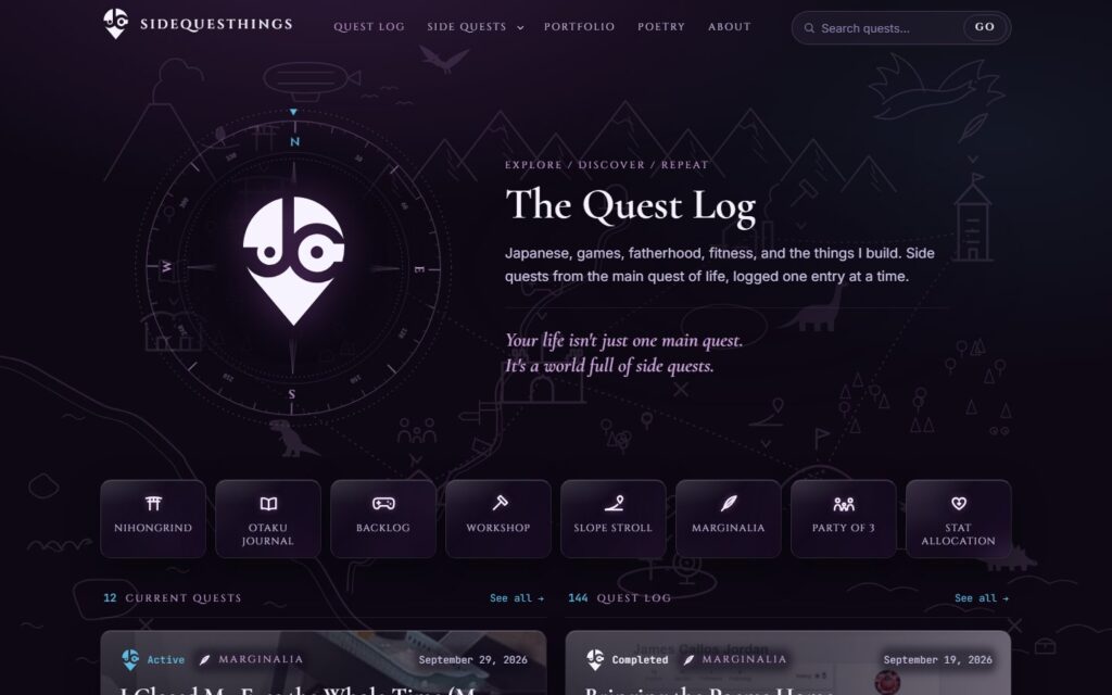
Sidequesthings had been running on version 2.4 of its theme: navy, orange and gold, a code-style label over every heading, and a ring of coloured category badges around a mark I no longer used. It worked. But I had a new brandmark, a white map marker with a hidden J and C and a pair of eyes, and the site still wore the old one everywhere.
I also had a look I already liked. Kosha, the personal dashboard I built for my own desk, has a night-purple, glass-panel style with serif headings and thin line icons. I wanted the blog to feel like it belonged to the same person.
So the goal for v3 was simple to say: give the whole site Kosha’s look and the new mark, and change nothing else.
Rule One: The Content Stays
“Change nothing else” was the hard part, and the part I cared about most. The site holds years of writing, including poems going back to 2004. A redesign that breaks old posts is not an upgrade.
I wrote the rule down before any styling started. Everything that holds content or meaning was frozen:
- Every post, category, menu and widget.
- The fields behind the quest status and the project details on Workshop posts, and the code names the templates call.
- The
shortcode, which keeps working and now draws the new line icon. - The existing wording in the templates, word for word. I allowed myself two edits, both to remove dashes I no longer write.
Then I restyled in place: the old theme’s logic stayed, the styles were rewritten, and markup changed only where the new look needed it. The new version also went in as a new theme folder rather than over the old one. Version 2.4 stays installed on the live site, untouched, and switching back is one click in Appearance. I never delete it.
The New Map
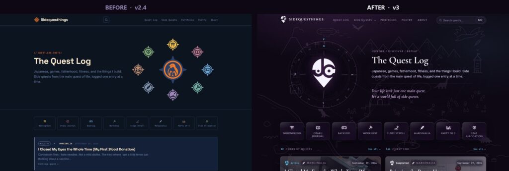
The home page is where the change shows most. Here is what I did and why:
- The mark sits inside a compass. It settles on load and then sways slowly. It is the only thing on the page that keeps moving, so it has to earn its place.
- A map sits behind everything. A faint overworld drawing, Kosha’s dinosaurs included, fixed behind the page at low opacity. It never moves or scrolls; it just makes the “quest” idea literal.
- Glass panels. Tiles and cards are frosted glass over the map, with a soft blur and a light top edge.
- Two lanes instead of one feed. The left lane is Current Quests, the right is the Quest Log of finished ones, five each, and each has its own “See all” page. On launch day that was 12 current quests and 144 in the log.
- The cover image behind each card. Every quest card now shows its post’s featured image, dimmed into the purple. Some covers have blurred borders baked in, so each post has a small setting that zooms the image past them.
The card images were the risky part, because a bright cover under white text can make the text hard to read. So I made a test with a mostly white image and had it measure the brightest pixel behind each piece of text. Where the date, the category and the excerpt fell under 4.5:1, each got its own soft dark scrim instead of darkening the whole picture.
Posts and Workshop Pages
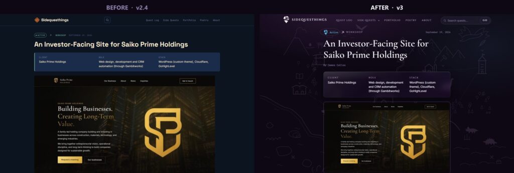
Post pages got calmer rather than busier: a serif title, a “By James Callos” byline (the site is openly mine now), and the project details for Workshop posts in the same glass as everything else. The status pill became a small version of the mark’s face next to the status word.
Small Reactions
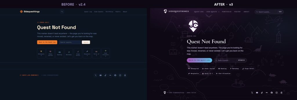
I kept the mark’s expressions for places where the site is reacting to you. The 404 page shows it confused, an empty search shows it sad, and the mark in the header blinks every 8 to 12 seconds. That’s it. A face that reacts to everything stops meaning anything.
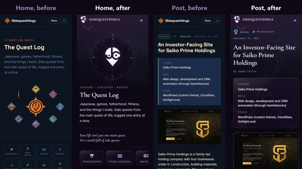
On phones the compass and mark stack above the heading, and the eight category tiles become one row you swipe sideways.
For anyone who has reduced motion turned on in their device settings, all of it holds still: no rise-in, no blink, and the compass simply points north.
Proving It Before It Went Live
Nothing went to the live site until it had passed on a staging copy. I want to be clear about what was measured there, because it’s the part I’d ask about if I were reading this.
- The content really did stay. A script fetched the text of every post from the live site and from staging and compared them: 156 posts and 1 page, all identical.
- An acceptance script of 51 checks, mostly a table of addresses: every kind of page answers as it should, and the privacy routes stay closed. All 51 passed. Separate checks found no links into the old theme folder and no raw shortcode text on any page.
- Lighthouse on mobile, the same machine for both: performance went from 85 and 86 on the old theme to 94 to 96 on v3, and accessibility from 95 and 96 to 100. The old theme lost points on colour contrast.
One number went the other way, and I’ll say it plainly: the home page and category pages are heavier, by roughly 275 KB and 320 KB. That is the card images; the old cards had no pictures. They load lazily, at most 768 pixels wide, and the scores above already include them.
Launch Day
Version 3 went live on 2026-10-11, and it wasn’t perfectly smooth. Right after I switched themes, the sitemap at /sitemap_index.xml returned a 404. Saving the Permalinks settings fixed it. The likely cause was how the new theme rebuilt WordPress’s stored URL rules on the first request after an update. I didn’t prove that, but I didn’t want to find out again on the next update either.
A fresh review of the whole theme that same day turned up that and a few smaller fixes, so version 3.0.1 went live the same day. It only rebuilds those rules when its own are actually missing, and only on an ordinary page view. After the update, the sitemap stayed up without touching Permalinks.
Two other launch steps are worth passing on if you run WordPress:
- Never use a host’s “publish staging” button for a theme change. On my host it copies the staging database over the live one. I uploaded the same theme zip to live instead.
- Close comments on old posts without editing them. In Settings, Discussion, I set comments to close on posts older than one day and turned pingbacks off on the same screen. Every old post closed at once, no post was saved, and no pingback went out.
What I Would Tell Someone Else
- Write down what must not change before you design anything. It turns a redesign into a restyle, and a restyle is much safer.
- Keep the old version installed. A rollback you can do in one click is the difference between a bad day and a bad week.
- Compare the content, not just the look. Screenshots tell you it looks right. A text comparison of every post tells you nothing was lost.
- Report the number that got worse. Page weight went up. Saying so is how the other numbers stay believable.
If your site needs a new look without losing what’s already on it, tell me the problem, and we’ll work out the fix together.